Are you looking for product designing suggestions that will allow you to have your product taken off the shelves as soon as possible?
The following are some of our favorite design suggestions for glass bottles, which can help your business to reach new heights.
Keep it Simple
For the best possible user experience, make sure that all of your designs, graphics, and fonts are uncluttered and straightforward. Customers are likely to be confused by your product label design if there is an excessive amount of information presented on it.
You do not want people to have to strain their eyes in order to determine what is included in the container. This is especially true for buyers who immediately check the nutrition information label upon purchasing a product.
If you don’t make it as simple as possible for them to get the information they’re searching for, they will seek elsewhere for a brand to purchase.
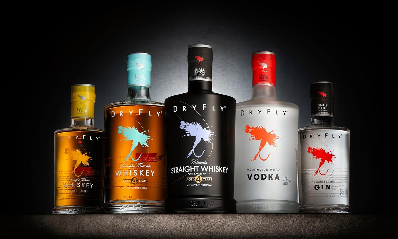
Make Intelligent Use of Color
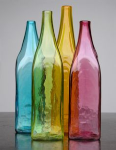
When it comes to capturing the attention of a consumer within the “half-second window of opportunity,” colors are very necessary. If you have a striking hue that stands out, people are more likely to stop what they are doing and look in your direction.
However, in order for the color to be effective for your product, it is necessary to employ it correctly. It is important to steer clear of the dreaded color clash. Make it a priority to choose colors that contrast well with one another and will look well together.
Because of this, your label will stick out in a favorable way that is much more noticeable. Keep your colors constant. When attempting to convey a sense of flavor, adhere to the colors that are often associated with that sense.
Your clients will have an easier time locating the flavor they desire as a result of this, which will result in an improved user experience. Consider adding a splash of color. It is much easier to catch someone’s attention when there is only a trace of color against a black or white background. This is an effective strategy when the colors of your brand are already black and white.
Make Sure You Use the Appropriate Font
If the typeface you’re using is too generic, it gives the impression that you simply chose the first thing that came to mind without putting much, if any, work or thinking into the process. Also, try to limit the number of typefaces you employ.
It is suggested to limit yourself to a maximum of two in order to maintain the label’s consistency and make it easy to read. Continue using the typeface that has already been established as the firm brand. People will have an easier time recognizing it, and it will remain consistent with the message you want to convey.
In addition to this, you should make sure that the font is at a size that is easily readable. If the print is too small, your clients won’t be able to read it. If you discover that you have to make everything smaller on your label in order to put everything on there, it is a good clue that you are including much too much text. Turn the page and look for places where you may reduce, condense, or eliminate unnecessary material.
Select a Shape That Is Not Common
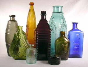
When you utilize a non-standard form on your bottle, it increases the likelihood that it will attract the attention of someone walking by as they see it. Numerous product labels are formatted in a conventional manner, typically taking the form of a rectangle or a circle.
Take into consideration the form that your package or container will take. Always check to see if the form corresponds to what you’re putting out there.
If it is too large for the container, the label will start to peel, crack, or fall off. If it is too small, the label will not fit correctly and will fall off. Therefore, it is not worth it to use an odd form if it does not suit your container well.
Make Use of Items of a High Quality
It makes no difference how beautiful your design is if the quality isn’t up to par. The higher the quality of your materials, the more positive of an impression you will leave on your clients. When a person takes up a glass bottle, they can immediately see that it is not made of high-quality material, regardless of the design that is printed on the bottle.
Your company’s brand is a reflection of both you and your organization as a whole. You’ve put in a lot of effort to develop what you have, so it would be in your best interest to shell out the additional cash and make sure you’re utilizing the highest-quality materials you can find.
Maintain Coherence with Your Identity as a Brand
Consolidating your brand identity is one of the most crucial things you need to accomplish for your business. Think about the concepts you wish to portray as well as the message that is sent out by your brand.
You don’t want to use typefaces and styles that remind people of their grandparents’ kitchen when you’re selling things that are sleek, modern, and stylish because consumers will associate such products with their grandparents.
Carry out the necessary research on both your intended audience and your main rivals, and choose an offering that will appeal to the former. If you already have a typeface and color scheme associated with your brand, you should always employ those.
It makes it easier for your consumers to recognize your goods and encourages them to continue selecting your product in the years to come.
Add Your Contact Details
Customers that have a pleasant and satisfying experience are more likely to submit feedback, either by going to your website or by getting in touch with you directly. This is an excellent method for driving traffic to your website, increasing the number of calls to your shop, or simply providing a forum for clients to voice their contentment.
You still have an interest in being told where you can make improvements, even if the criticism isn’t always good.
It is essentially necessary to include contact information on your label if you are selling your goods at a conference, festival, or any other type of special event so that customers may find you again in the future.
When clients use your product in the comfort of their own homes and discover how much they like it, they immediately want to know where they can get more of it from you.
Ensure that the Packaging Incorporates Your Brand
Maintaining coherence in the nature of the goods you provide for sale is of the utmost importance. If you were selling an organic line of organically derived, raw food goods, for instance, you would want to utilize environmentally friendly packaging that was made from recycled materials. In such a case, you are not going to reach any of your intended customers.
When your product’s brand and its packaging are complementary to one another in an ideal way, you create an emotional connection with your customers that encourages them to purchase your goods.
Find a Unique Feature
One of the most effective strategies for making your products stand out from the competition is to look for something distinctive that you can connect with your brand and that very few other businesses are doing.
Some companies, such as Jones Soda, want to put unique visuals on each and every one of their goods, such as a distinct photograph on the front of the bottle. This speaks to the personality of the buyer, and it also appeals to those collectors out there who absolutely have to have as many as they can get their hands on.
Some other businesses like to highlight personal themes, such as the founder’s life story or a humorous narrative about the process of creating the product in question. Find an item that your clients are likely to be interested in collecting, and that will start to become associated with your brand.
A good illustration of this is the Canadian beer brand James Ready, which is produced by Moosehead Brewing Company. There is a clever saying printed just below the cap of each and every bottle of beer. These slogans have come to be identified with the firm and the product that it produces.
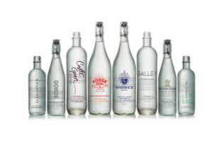
Your Designs Can Be Printed Directly on the Bottle
Your product will undoubtedly stand out from the competition if the design you choose to use is printed right on the bottle. Customers will have a much simpler time recognizing the bottle’s tiny features and lines when the label is integrated into the bottle itself.
In addition to this, your clients will view your product as a higher-quality and premium alternative that better caters to their requirements and preferences as a result of using it. This helps to prevent your trademark and label from coming off, folding over at the edges, or becoming ripped in any way.