Glass Juice bottle design make brands stand out
Juice has been a staple in our diet for ages, more and more companies are turning towards their juice bottle designs and labels to stand out in the massive industry. Juice brands have a number of ways to represent themselves with the names of the juice, color of the labels and the size and shape of the bottles.
Some companies look to use bold colors to represent their brand where others are trying to keep the bottles simple. There are benefits to both techniques. A simple design such as a clear bottle will give the user a view of the contents of the package so they can see exactly what they’re buying. A more elaborate bottle design could be used for a super healthy juice (perhaps one that doesn’t look as appetizing) to brand itself with bright colors.
In this article, we will introduce some juice bottle with branding trend design.
Juice glass bottle design trends
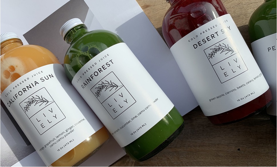
1. Lauren Nicole Foot recently completed this branding design for RAW, a health-focused bar and kitchen located in Vancouver, Canada. Minimalist text stating the benefits of the product is used so that customers can understand the advantages of these drinks immediately, and not become distracted with overcrowded details.
The text has been attached directly to the clear glass bottles, making the color of the drinks stand out and provide the perfect backdrop for the lettering. Each drink is named after a certain beach or hiking spot in beautiful Vancouver, so one of the goals with this branding was to associate the healthy results of combining outdoor activities with food that supports this lifestyle. The text on the back stating the health benefits of these drinks achieves this goal while ensuring the packaging will stand out on the shelves.
- Our similar glass bottle style is
350ml juice glass bottle
with metal cap or tamper evident plastic caps.
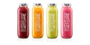
2. For his juice packaging project, Brazilian designer Renan Artur Vizzotto worked to marry text and graphics to creatively represent the contents of each vessel. The lovely milk bottle form was chosen to hold the range of four healthy beverages, each one exuding a vivid color that suggests the flavor inside.
The unusual approach is quite evident since the bottles appear nearly void of any text. A single brown circle labels every one with the basic and direct description of the contents, be they Apple Juice, Pear, Banana or Cashew Juice. This and the bright color differentiates each variety.
The designer carefully devised a Pantone palette to come up with the tones for the intriguing illustrated graphic. The muddled images include fruit motifs that have been shaped by the words that describe them.
Our similar glass bottle style is
250ml and 500ml milk glass bottles
with lug caps
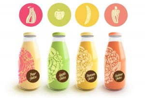
3. It might not be until you start to consider the appearance of Thise Mejeri packaging that you’ll realize how remarkably different it is from that of most bottled beverages. The glass of drink flasks is typically treated to a smooth polish in order to give off a high-gloss shine.
This design by Randi Sjaelland has a soft matte finish, made possible by a frosted texture and an opaque material. The vivid hues that you’re seeing have been artificially applied to represent the fruit flavors of the individual dairy refreshments.
The iconic milk bottle form is a fetching throwback, and so is the cursive typeface of the logo and the label. Thise Mejeri packaging is visually stimulating in the contemporary sense with its more minimal concept and its colorful character.
Our similar glass bottle style is
250ml and 350ml round juice glass bottle
with tamper evident plastic caps.
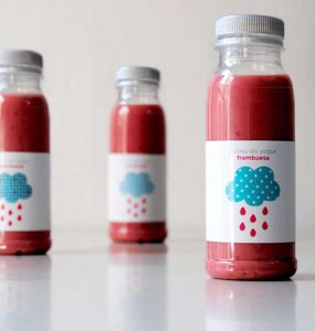
4. Spanish design firm Regina Puig wants consumers to imagine a world where delicious smoothies rain from the sky. This whimsical re-imagining of the planet’s precipitation was the focus of the company’s design for the Nubes De Yogurt packaging. The brand’s kitschy name literally means “smoothie clouds” in Spanish.
Spanish design firm Regina Puig wants consumers to imagine a world where delicious smoothies rain from the sky. This whimsical re-imagining of the planet’s precipitation was the focus of the company’s design for the Nubes De Yogurt packaging. The brand’s kitschy name literally means “smoothie clouds” in Spanish.
The packaging uses colorful representations of common textile prints to add visual interest to the brand’s simple trademark rain cloud. The rest of the label is left relatively unadorned. Sporting simple typography and a clean white backdrop, the vibrant clouds are left to do the talking and the selling. The simplicity of the label also allows the eye-popping color of the beverage itself to stand front and center on store shelves.
Regina Puig have crafted a packaging design that is as whimsical and vibrant as the product its houses.
Our similar glass bottle style is
juice milk glass bottles
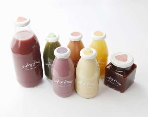
5. The color of fruit is a huge part of what makes it so delicious looking, and when it becomes bruised, discoloured or oxidized, it can look much less appealing; when strawberries and apples change from tantalizing shades of bright red to murky browns, it hardly makes you want to take a bite out of them — even if they are perfectly edible.
To address this, Mirim Seo devised ‘Ugly Fruit,’ designed to bring awareness to this wastefulness: “Ugly Fruit is a stand that makes juice, jams, and dried fruits out of unattractive produce donated from our neighborhood grocery stores.”
The beautiful packaging reveals the earthy tones of the new fruit-made juices, jams and dried fruit snacks. By increasing the appeal of these perfectly good fruits, hopefully fewer of them will go to waste.
Our similar glass bottle style is
ball shape glass bottles
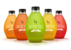
6. Design student Mara Rodriguez created these jewel-toned juice bottles for the fictional company Deer You. Deer You is an organic juice company, dedicated to using only the finest ingredients in each bottle of premium juice. Free of synthetic materials and additives, these sweet sippers are sold as the perfect choice for nature-lovers and the health-consious.
Mara Rodriguez sought to create packaging that represented the natural components of the product itself. Inspired by the canteens explorers and outdoorsmen keep strapped to their hip, Rodriguez devised an almost egg-shaped clear bottle to showcase the natural hue of the juice inside. The Deer You label itself features a majestic deer showing off the full span of his antlers. The font chosen to represent the company’s name would look right at home at any campsite sign.
(Source: www.trendreports.com)